
Avalian
Be precisely when your members need you to be. The Avalian essence should always be availability.
The app that integrates everything that Avalian has to offer as a medical coverage company.
The focus is to provide dynamic and frequent solutions directly from the app. The design of the experience is completely focused on the people involved: doctors, members, providers, partners, beneficiaries, etc.

The Research
Digital experience
1. Dialogue: App / User - User / App
2. One thing at a time
3. I know where to start: Visual Order
4. I dare to tap: Predictable and safe
5. Immediacy: Actions for every day
6. Significance: Brand personality

The Design System
Foundations
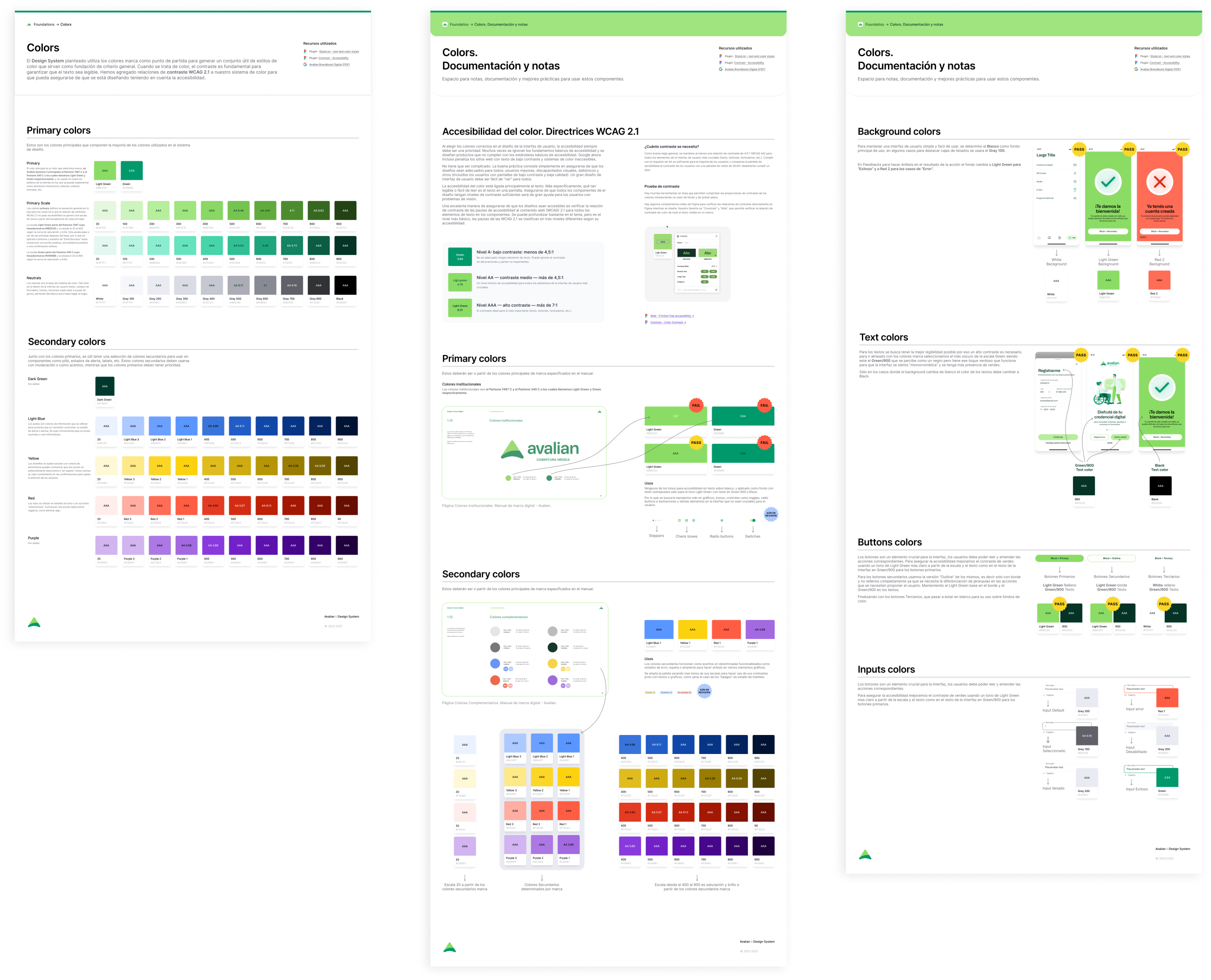
Color Styles
The Avalian design system establishes a purposeful set of color styles as the perfect starting point. When it comes to color, contrast is critical for ensuring readable text. We've added WCAG 2.1 contrast ratios to our color system to ensure accessibility standard.
Typography
A purposeful set of typographic styles was develop to establish the hierarchy and consistency of the design system. We’ve tested this typographic scale to make sure it’s robust enough to be used across the project, while remaining as accessible as possible.

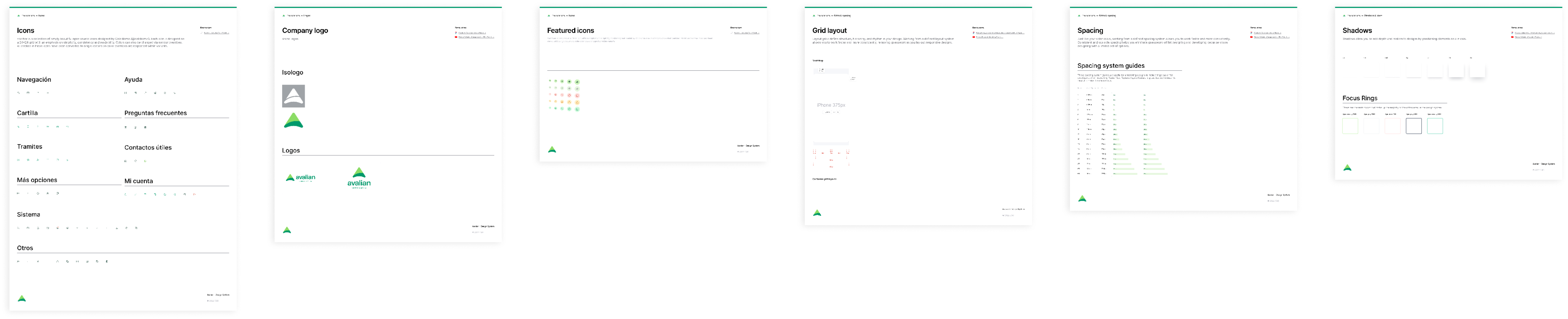
Icons
System Icons
Each icon is designed on a 24x24 grid with an emphasis on simplicity, consistency and readability.
Company Logos
Avalian logos were added to the design system according to brand guidelines.
Featured Icons
A set of Icons in containers to give emphasis on specific actions.
Grid layout
Layout grids define structure, hierarchy, and rhythm in the design. Working from a defined layout system allows better and more consistent production, removing guesswork as responsive designs are lay out.
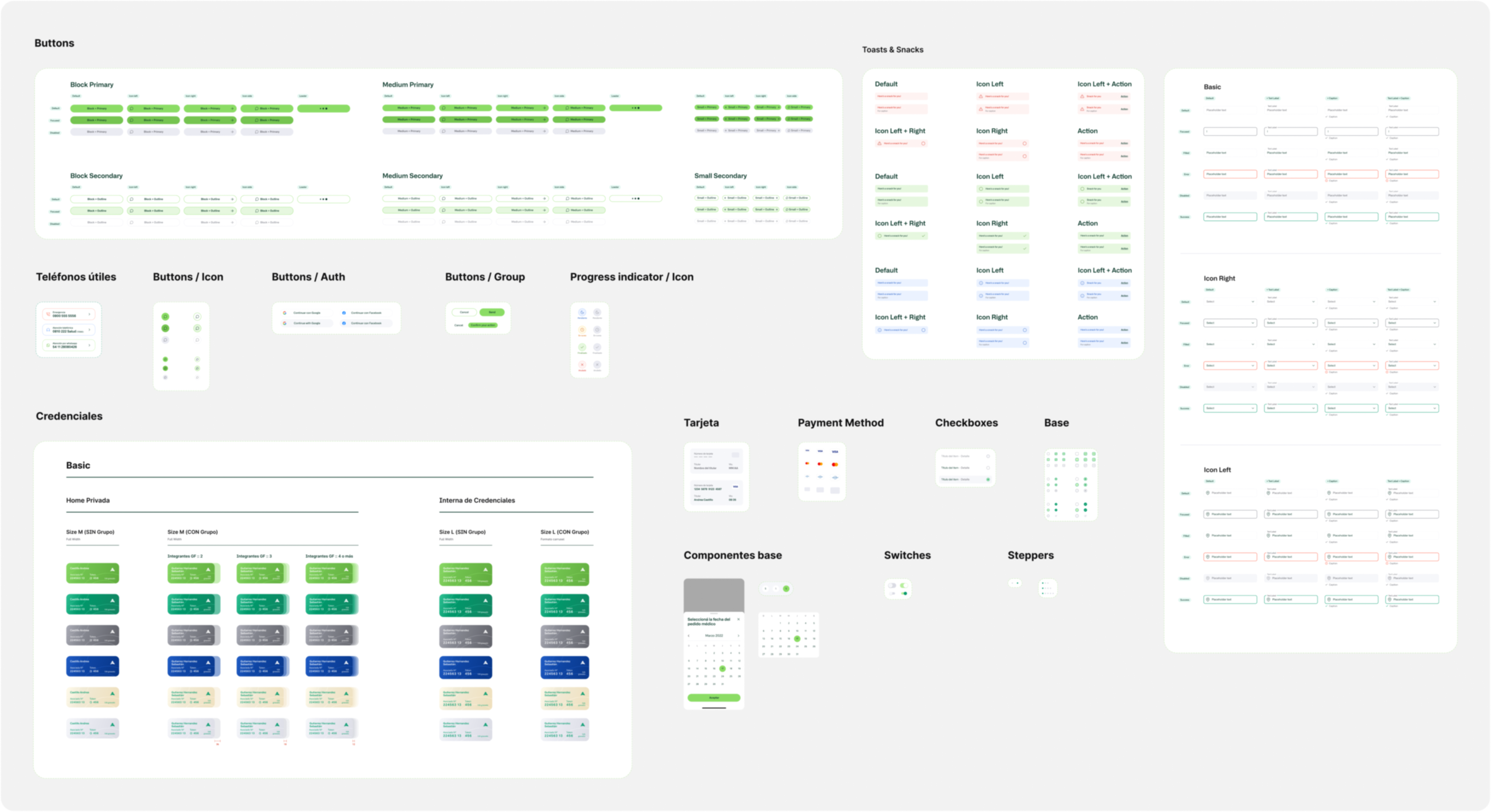
COMPONENTS
Atoms, Molecules & Organisms.
A design system based on "the atomic design" methodology. We defined symbols, components, templates and assets that allowed us to maintain order and consistency during all the design springs.
The result

Users can navigate the application with ease and security. The app provides clear and recognizable actions, not burdening the experience with unnecessary explanations while also making progress in flows more dynamic.
.png)