
Hemp lab
The faculty to certify and guarantee the quality of cannabis´ derivatives with a high level of confidence. A new brand, and new service in Argentina.
More than being a laboratory that professionalize the production of cannabis, the goal is to raise awareness.
People deserve quality information about healthier and more natural alternatives to medicines that will allow them to improve their quality of life.

Stage 1
Branding concept
1. Define brand values
2. Establish a brand philosophy
3. Achieve a voice or communication style
4. Set a Brand Architecture


Stage 2
Making the Brand
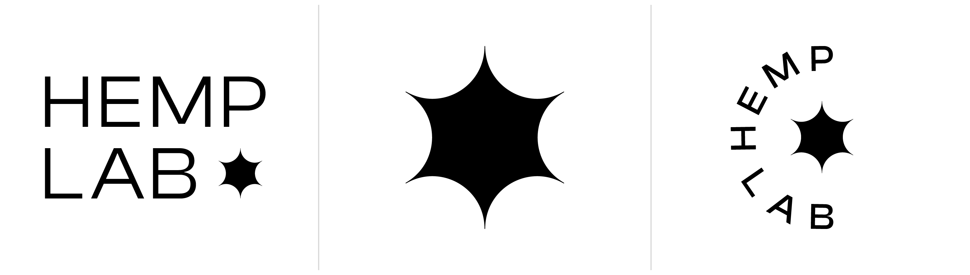
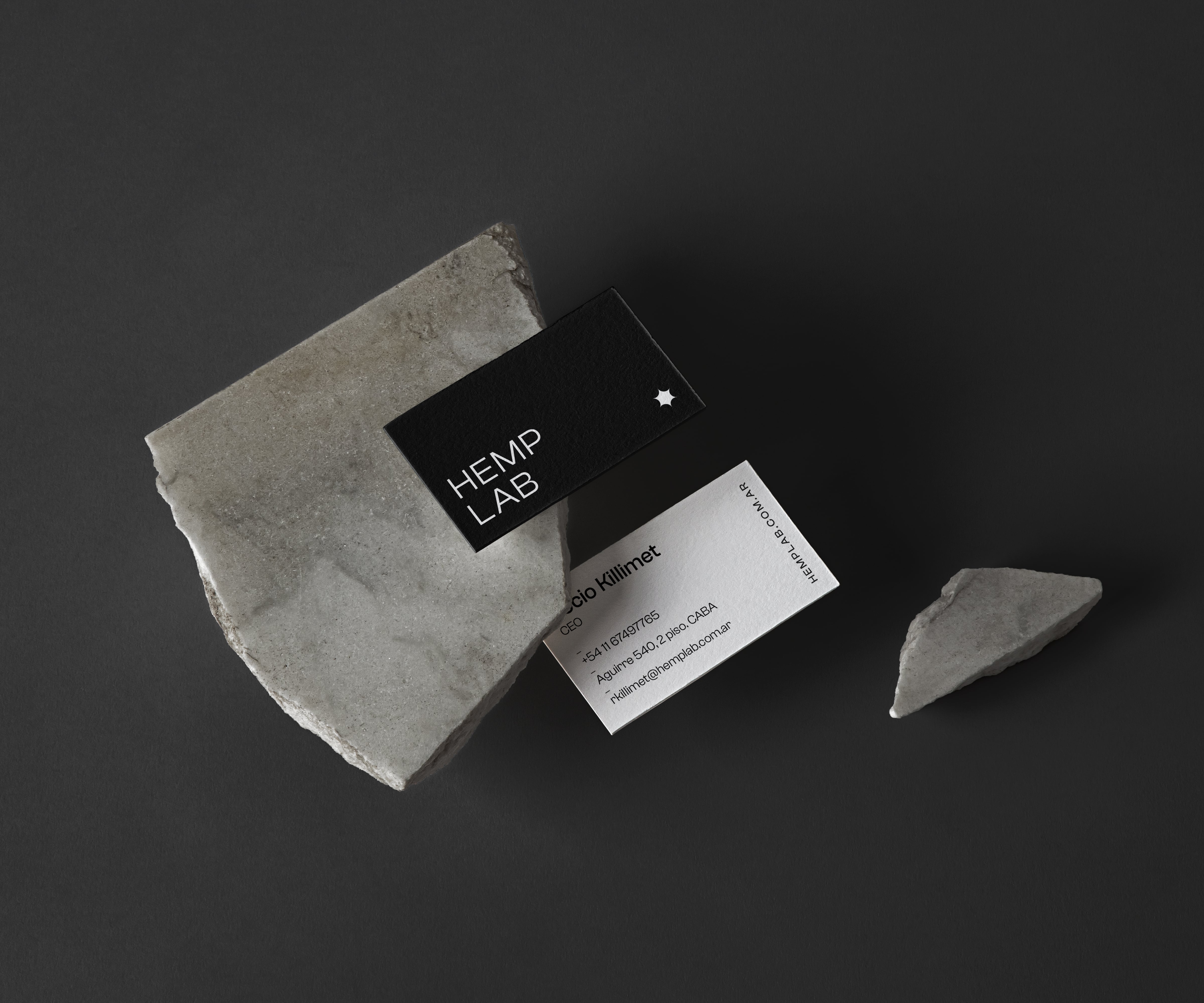
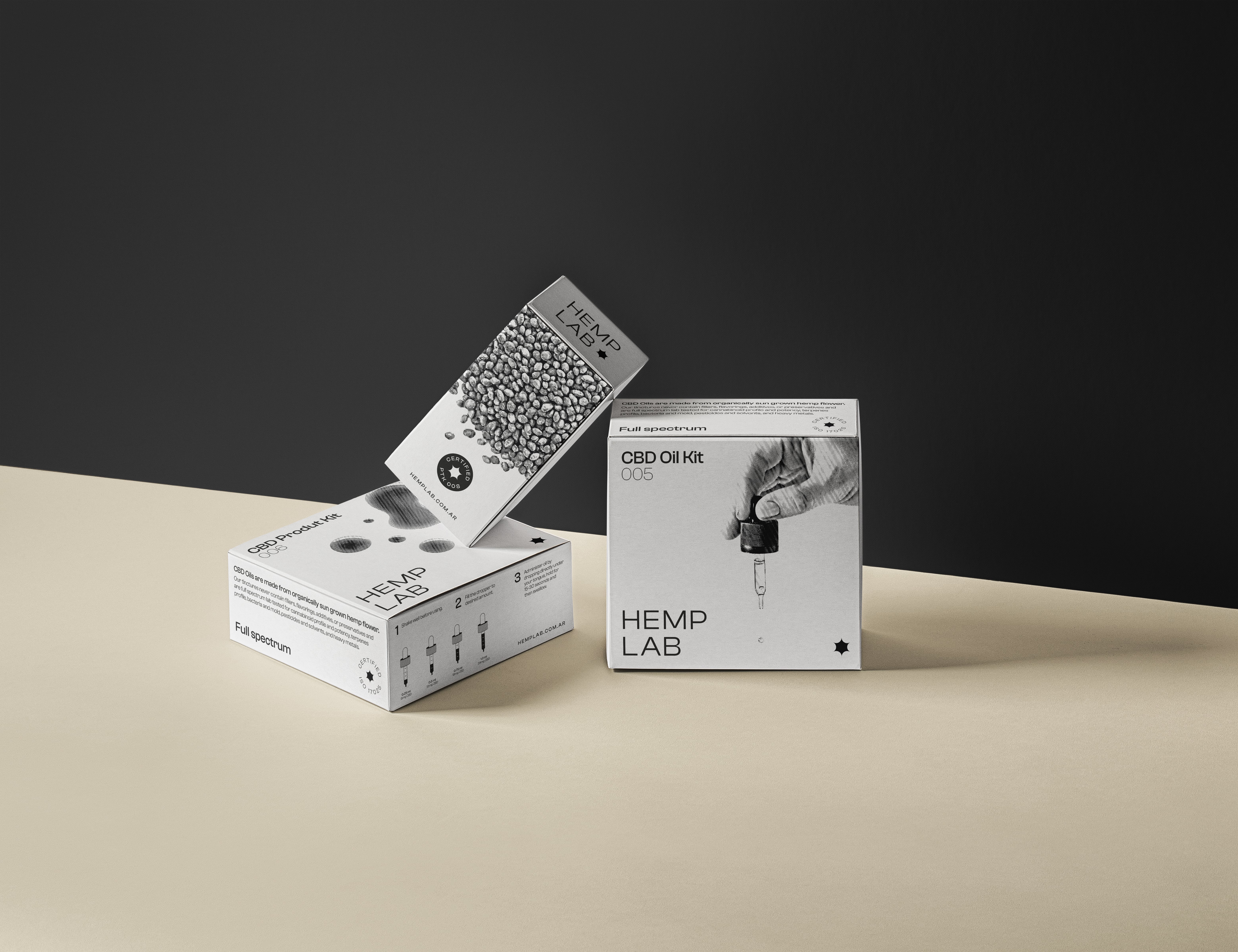
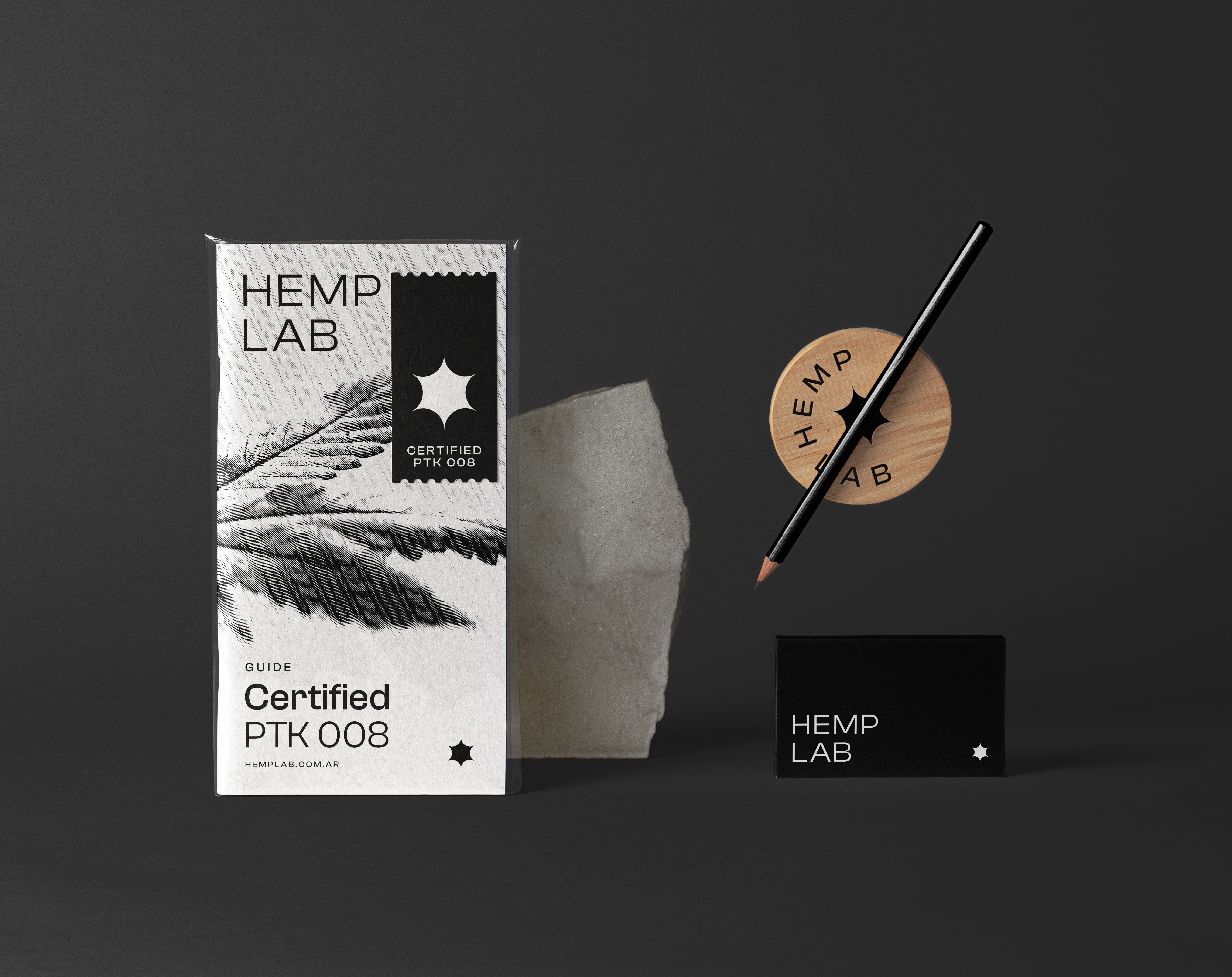
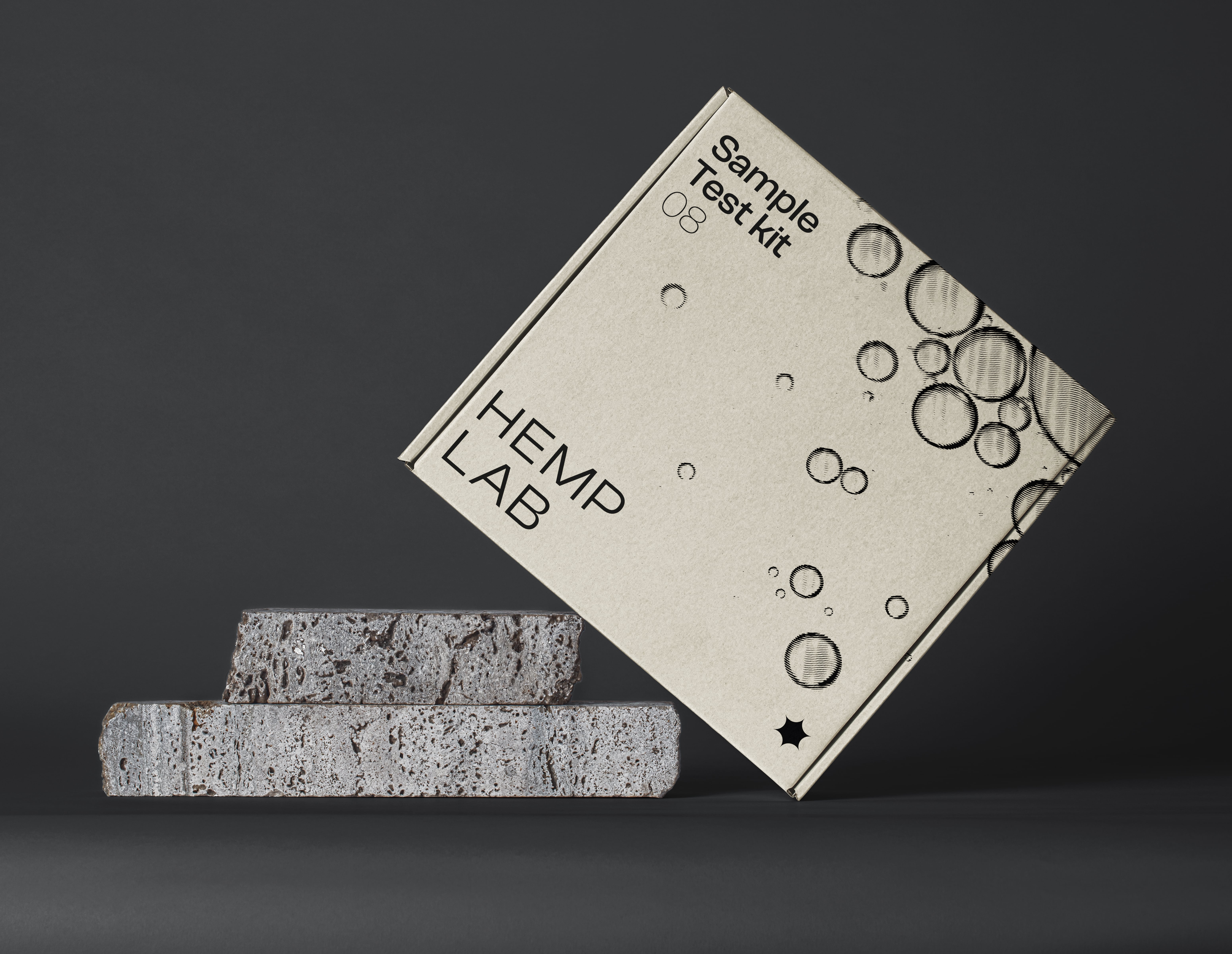
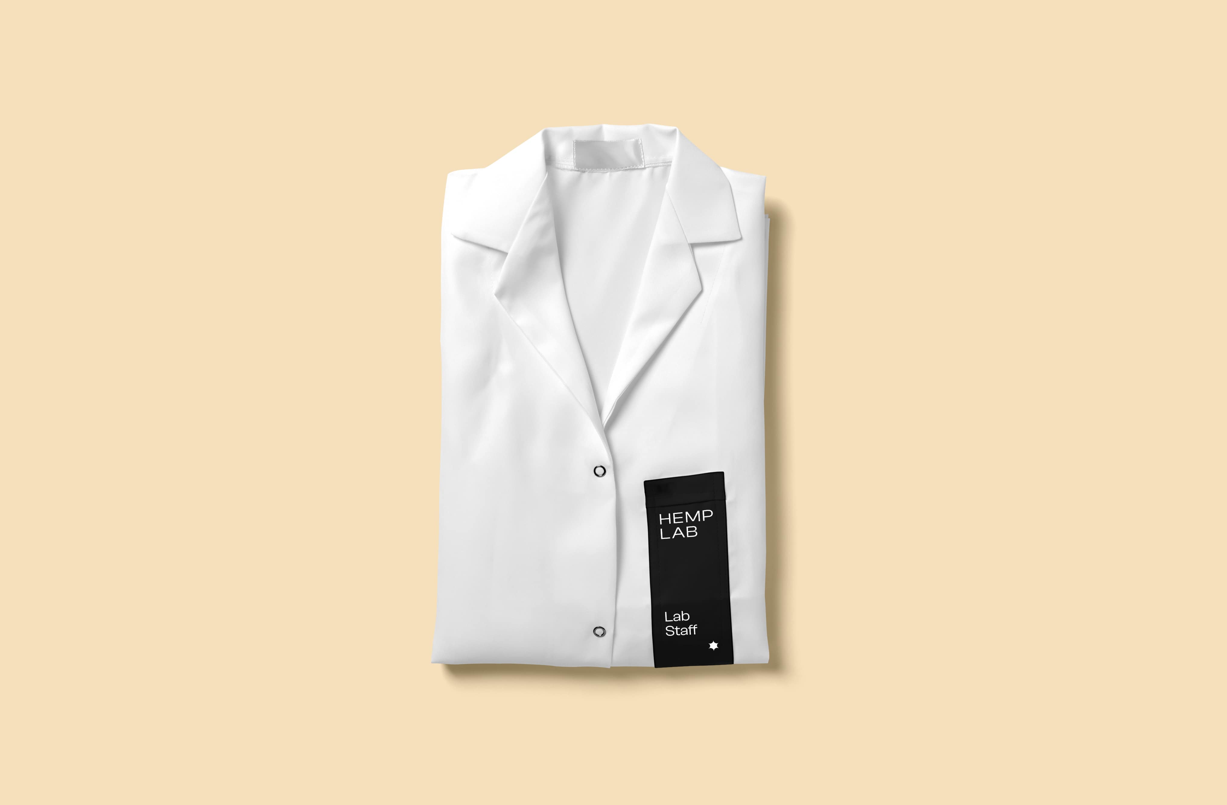
The mark
The logo is basically the written brand name. It must be readable.
For Hemp lab, a sans serif typeface was used as a base over capital letters and lineal characters to reflect simplicity.
“Logos are a graphic extension of the internal realities of a company.”
_Saul Bass
Logo Symbol
The logo symbol or "isotype" is the part of the identity that functions as the minimum expression of the brand. For Hemp lab, a simple shape was developed based on the symbolic structure of a star, a hexagon and the "verified (social media) icon".
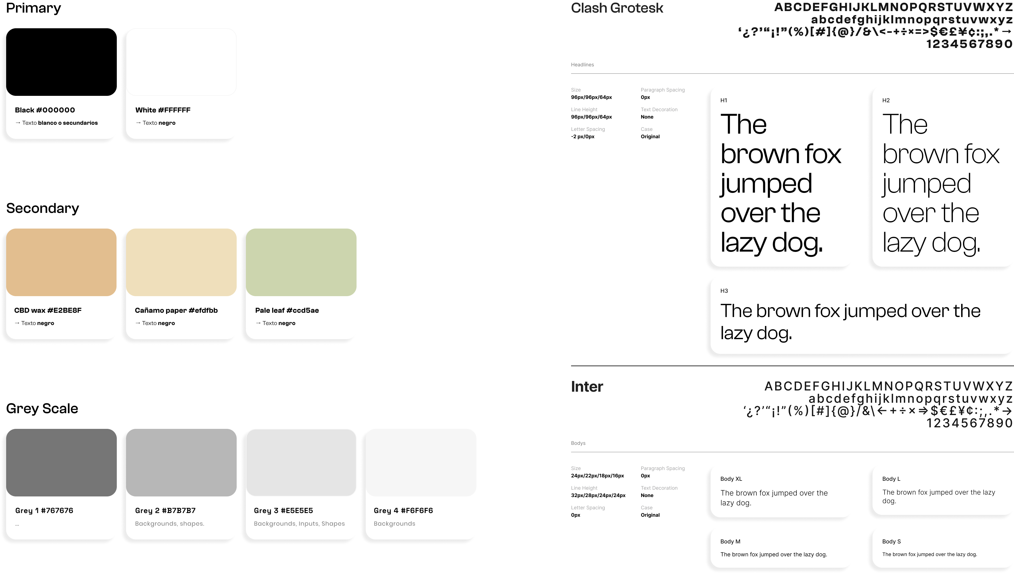
Colors
For the brand's color palette, it was proposed to give prominence to the high contrast of black and white. Color is only provided as a visual support with soft and natural tones that would work in backgrounds or in key situations.
Typography
The Clash Grotesk family font balances hierarchies perfectly with its different styles finding a cohesive aesthetic. This is complemented by Inter font for long texts and UI.
The Clash Grotesk font is a san serif typeface with structured and simple characters. Its compositional structure has attitude, imposingness and personality. We proposed it for titles and headings.
The inter font is a typography that has good legibility and works very well on digital platforms, that's why we proposed it for long texts and controls.
Icons
Abstract figures that represent specific ideas and concepts were built from modular forms and simple geometry.

Stage 3
The Website
Intuitive navigation for better decisions
The website was designed to help users take more informed decisions through what we call "decision components": knowing the characteristics of a service, knowing how to compare it to others, and knowing the different methods of testing, certifications and support.


Support portal
The support portal is organically integrated in a transversal way, unifying navigation criteria and the user's journey experience throughout the Hemp Lab´s website.

The challenge was to precisely determine the target users we were designing both the brand and the website for and offer a simple and decisive proposal.